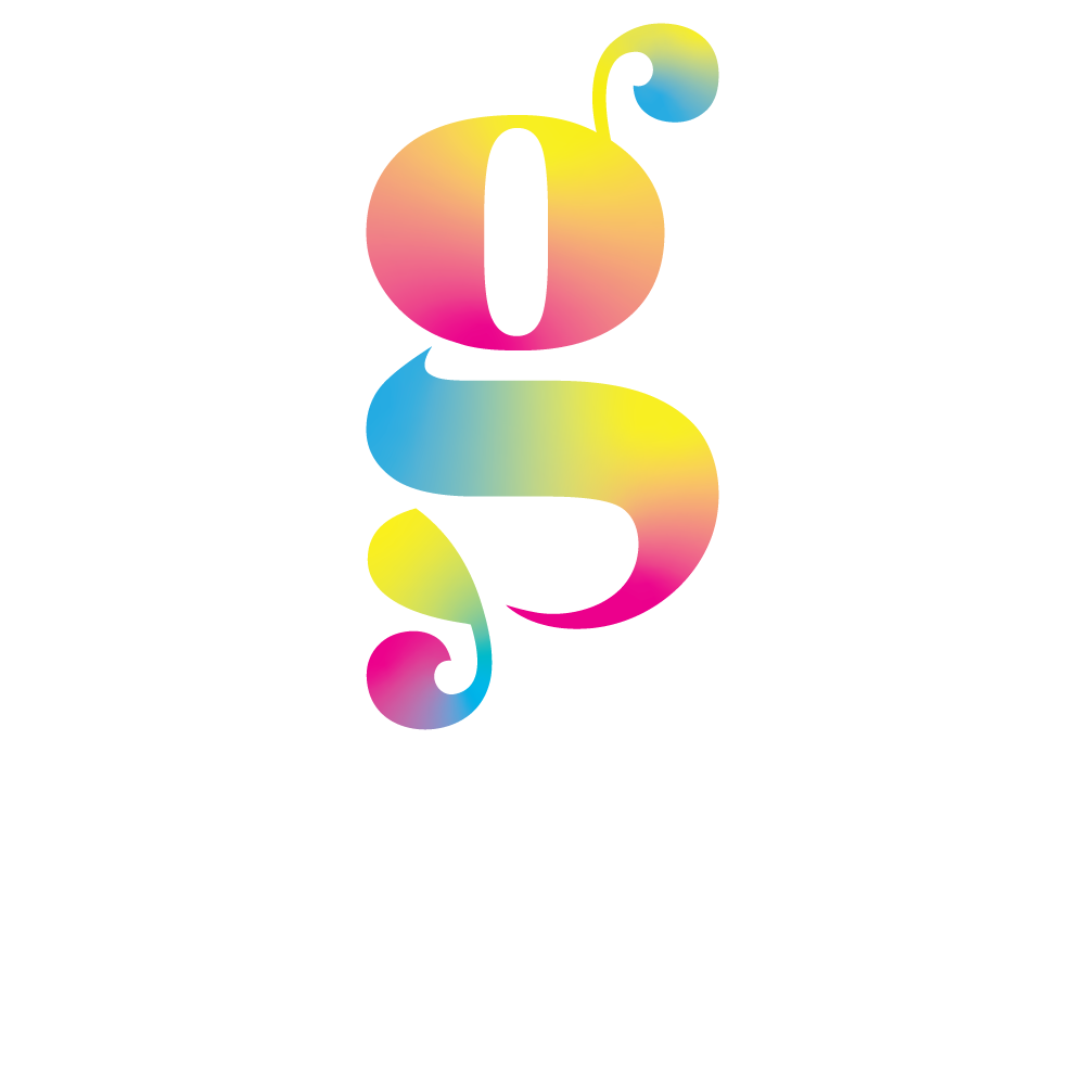
Client: Art by Lrae, Semaj Lrae.
Scope of work: Logo design, marketing materials, website design and setup (Square)
For the brand’s visual direction, I leaned into a mix of still-life photography, collage elements, and vibrant, contrasting color swirls to complement the artist’s unique style.
The logo reflects the fluidity of acrylic pouring, merging into the name "Lrae" in a bold and eye-catching way. Unlike traditional artist signatures, it stands out with a psychedelic, retro-inspired type style reminiscent of the 60s and 70s.
When designing the website, I worked within the framework of a Square Up template, which gave me valuable insight into accessibility constraints. As a platform, Square Up prioritizes accessibility best practices, shaping design decisions around usability. I found this fascinating and appreciated how platforms were increasingly prioritizing accessibility to improve the overall web experience.
